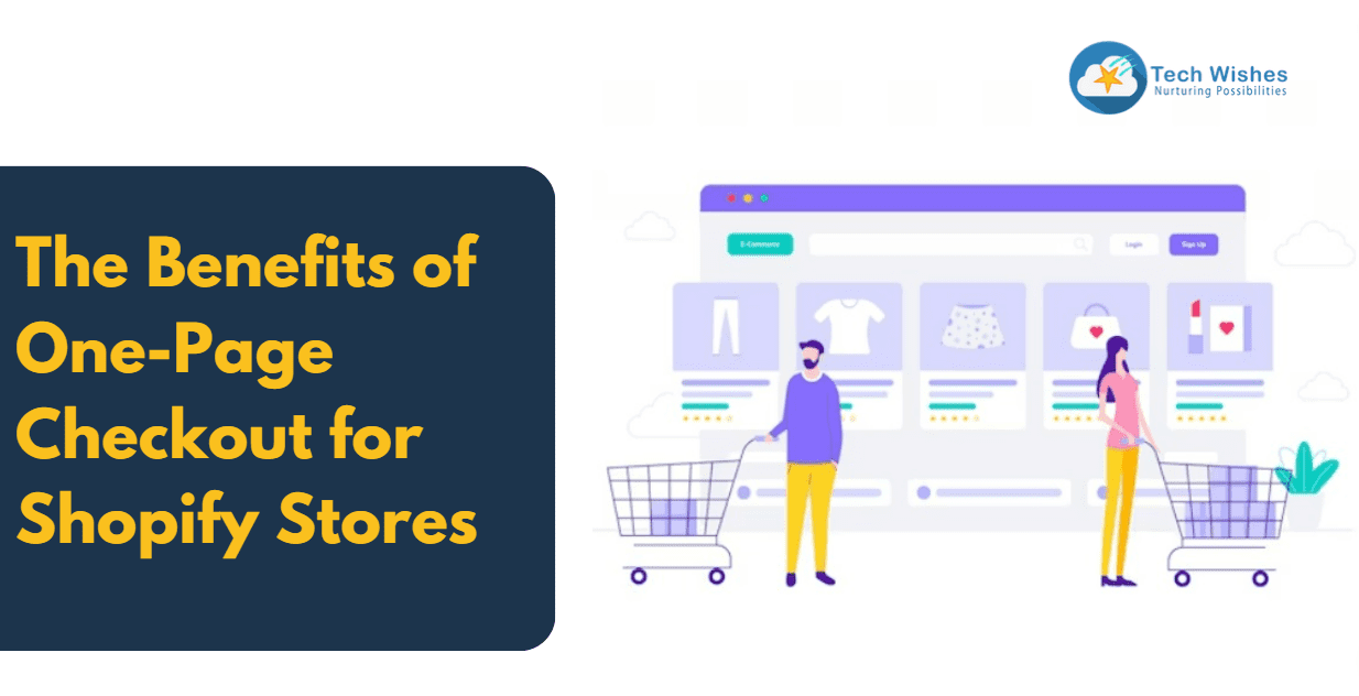
In the dynamic world of e-commerce, optimizing the checkout process is paramount for driving conversions and ensuring a seamless shopping experience. Checkout is the final and crucial step where a browser converts into a buyer. Shopify recently rolled out its new update where the 3 pages of the checkout section are seamlessly converged into one.
Join us on this exploration of how a one-page checkout can elevate your Shopify store’s performance and customer satisfaction.
Understanding one-page checkout
Customers may understand the need to fill in the information correctly to ensure that the product is delivered. Still, multiple checkout pages may bog down the process and take longer to complete. One page checkout feature has taken all the elements of a standard checkout process and merged them into one. When the customer reaches the checkout page they will find the shipping address, billing options, and all the cart contents there. Initial data shows that there has been a 7.5% improvement in the conversion rate since the one-page checkout was implemented.
One-page checkout vs multiple-page checkout
Does a one-page checkout suit everyone?
Generally, it is noted that a one-page checkout is better for a younger demographic with low average order value and traffic from mobile. For businesses with big orders, for example, a furniture business that offers customizations then a multi-page checkout will be more suited and useful.
Contents of the one-page checkout
The specific content on this page may vary depending on your store’s design and any additional apps or customizations you have. However, here are the common elements you’ll typically find in a one-page checkout for a Shopify store:
1. Customer Information:
– Shipping address
– Billing address (if different from shipping)
– Contact information (email and phone number)
2. Order Summary:
– A list of the products in the cart, including product names, quantities, and prices
– Subtotal, shipping costs, taxes, and any discounts applied
– The total order amount
3. Shipping Options:
– Shipping method choices (e.g., standard, expedited, etc.)
– Estimated delivery times
– Shipping costs associated with each option
4. Payment Information:
– Payment methods (credit card, PayPal, etc.)
– Fields for entering payment details (credit card number, expiration date, CVV)
– Billing address (if different from shipping address)
5. Order Review:
– An option to edit or update the order
6. Promotional Codes:
– A field to enter any discount or promo codes
7. Terms and Conditions:
– Checkbox for agreeing to terms and conditions or store policies
8. Place Order Button:
– The final step where customers click to confirm their purchase and complete the transaction
The goal is to provide a frictionless and straightforward experience for customers, encouraging them to complete their purchases with ease.
Advantages of one-page checkout
- For customers- one-page checkout reduces the number of steps, saves time and makes it easy to purchase.
- For business– Faster processing leads to an increase in conversion rates. Site performance also improves with one-page checkout and it is more convenient for mobile e-commerce. It also helps with cart abandonment issues, as customers will be able to complete their purchases swiftly without any distractions. With faster checking and processing customers become happy and satisfied, shopping more and returning frequently. Improving customer retention and satisfaction.
Some disadvantages of one-page checkout
- Long scrolling- just like every coin has two sides one-page checkout has some disadvantages as well. On one hand, it can reduce customers’ inconvenience on the other it could lead to long-tail scrolling which could be annoying.
- Complexities in analytics– analytics is easier when there are multiple pages and sections, as that can help the store owners understand where the customers are abandoning the process and how they can improve that. Also, it might be challenging for the tool to deal with multiple sections and resources on a single page.
Initially available only for Shopify Plus business owners now the one-page checkout feature is available for all stores. This streamlined approach to the checkout process offers numerous benefits for both e-commerce businesses and their customers. It enhances the user experience, reducing friction and simplifying the path to purchase. This is particularly advantageous for younger audiences and mobile users who value speed and convenience. Furthermore, a one-page checkout often leads to higher conversion rates, as it minimizes cart abandonment rates and encourages impulsive buying decisions. For businesses with lower average order values, this can be a game-changer.This one-page checkout is built on Checkout extensibility giving merchants flexibility to seamlessly integrate with existing extensibility apps.
Implementing a one-page checkout is a strategic move that can lead to increased sales, satisfied customers, and ultimately, the growth and success of your online business.


