As brands grow their online presence, impressive design often becomes an aspiration—but not always a conversion driver. Great-looking designs are only powerful when backed by data that proves they move the needle. So, how do you quantify the effect of web design on conversions—and optimise it over time?
At Tech Wishes, our expert web design services blend aesthetics, UX, and CRO science. Today, we’ll explore exactly how to measure design-led conversion improvements—and maximise the ROI every pixel delivers.
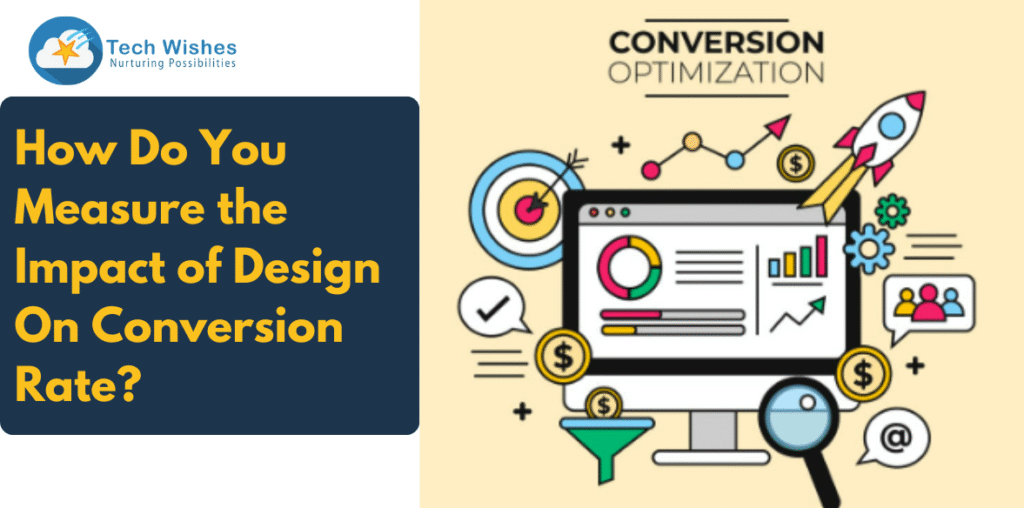
Why Measuring Design Impact Matters
- A beautiful layout is only half the story—users need flow, clarity, and trust signals.
- Better design = lower bounce rate, more clicks, longer sessions.
- When brands can tie good design to tangible metrics, they can optimise with confidence and scale smarter.
Which Metrics Reveal Design Effectiveness?
Here’s what to look for to assess design ROI:
- Conversion Rate: The ultimate indicator—percentage of page visitors completing the desired action.
- Bounce Rate & Exit Rate: A high bounce rate suggests design friction or misaligned flow from ads or search.
- Time on Page & Scroll Depth indicates how engaged users are with your content or layout.
- Heatmaps & Clickmaps Reveal hotspots and cold areas—where design pushes action or blocks it.
- Form Abandonment Rate: How many users exit before completing forms? Design complexity often plays a role.
- Page Load Speed Visual elements, animations, or widgets can impact Core Web Vitals and conversions.
- A/B and Multivariate Testing: Direct comparison of layout variations to see what boosts conversion.
The Tools That Help You Gauge Design Impact
- Google Analytics – Tracks bounce, conversions, and session duration.
- Hotjar / Crazy Egg – Heatmaps, scroll maps, session replay.
- Google Optimise / Optimizely – A/B / multivariate testing for design changes.
- HubSpot or Mixpanel – Funnels and behaviour tracking across pages.
- PageSpeed Insights / GTMetrix – Speed reports and performance suggestions.
How to Run Design Experiments Correctly
1. Start with a hypothesis
Maybe your new CTA placement will improve clicks, or simplified header navigation will reduce exits.
2. Make one design change at a time
This allows you to identify exactly what caused the improvement.
3. Randomise and split traffic
Split approximately 50% of visitors to each version to avoid seasonal skew.
4. Track each version’s performance
Use your tracking tools to monitor conversions, time on page, and behaviour metrics.
5. Act on the results—then iterate
Winning variants become permanent, and next-level experiments follow.
Design Changes That Often Move the Needle
CTA Placement & Colour
A test by HubSpot found that buttons above the fold, and in a contrasting colour, can boost conversions by up to 21%.
Hero Image vs. Video
Some brands convert better with a simple hero image than with autoplay video, which could distract or slow the page down.
Testimonials & Trust Badges
Adding client quotes, logos, or secure badges near signup forms can lift trust and reduce hesitation.
Minimal Navigation on Landing Pages
Removing header menus during paid campaigns helps keep visitors focused on the goal.
Mobile UX Adaptations
Ensuring touch targets are big, forms are simple, and layouts are responsive can cut mobile bounce rate by over 30%.
Real-World Case Study: Tech Wishes in Action
Client: D2C wellness brand on Shopify
Challenge: High traffic, low cart conversion
Experiment: Redesigned product page to test four variants:
- Variant A: Original layout with multiple image carousels
- Variant B: Sticky “Add to Cart” CTA and optimised load
- Variant C: Added urgency countdown timer
- Variant D: Added customer review slider near CTA
Results:
Variant B saw a 28% lift in add-to-cart clicks and 14% higher conversion rate. Heatmaps showed users were mis-clicking carousels in A, and scrolling past the CTA—Variant B solved both issues.
Checklist: How to Measure Design Impact in Your Workflow
| Step | Action |
| 1 | Define your target pages (e.g., landing page, product page, form flow) |
| 2 | Select performance metrics (conversion rate, time, bounce, forms completed) |
| 3 | Set baseline performance from analytics |
| 4 | Launch an A/B test with purposeful design changes |
| 5 | Use heatmaps to uncover behavioural friction points |
| 6 | Implement the winning design and review performance again after 2–4 weeks |
| 7 | Repeat optimisation cycle—design never truly stops |
Why It Pays to Measure Consistently
- Design choices become performance-enhancing, not just visually pleasing.
- Small improvements compound into significant ROI uplift over time.
- You align marketing, UX, development, and branding teams around measurable goals.
The Tech Wishes Advantage
When you work with Tech Wishes for web design:
- We begin with a conversion-first audit
- We design with CRO principles baked in
- We help you test every choice—copy, visuals, page flow
- We iterate continuously based on data and user behaviour
That means every design upgrade is rooted in insight, not guesswork.
Final Thoughts: Is Your Design Helping or Hindering Growth?
If you’re launching graphics without tracking impact, you’re likely missing opportunities. Identifying what resonates—and removing stumbling blocks—turns beautiful pages into revenue pathways.
As experienced web designers suggest, great design should do more than look good—it should lead visitors forward.


