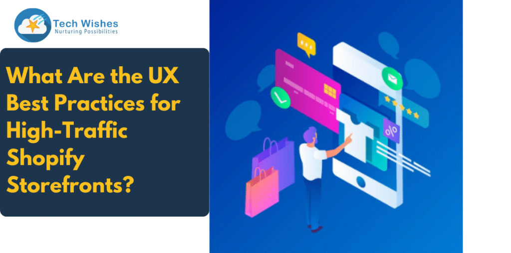
When your Shopify storefront starts attracting high traffic, it’s both a win and a warning. A win because your marketing, SEO, and brand awareness strategies are working—but a warning because if your user experience (UX) isn’t optimised, you’re likely leaving money on the table.
At Tech Wishes, we’ve helped 100+ premium D2C brands scale their Shopify stores through conversion-focused web design services. One thing we’ve learned? Traffic without solid UX is like pouring water into a leaky bucket.
So in this blog, we’re diving deep into the UX best practices every high-traffic Shopify storefront should follow to boost retention, reduce bounce, and convert browsers into loyal buyers.
Why UX Matters More When You Scale
When your store gets a few dozen visitors a day, minor UX issues might fly under the radar. But once you’re getting hundreds or thousands of daily users, those issues multiply—fast.
Poor UX Can Lead To:
- Increased bounce rates
- Lower conversion rates
- Cart abandonment
- Lost customer trust
And the worst part? High traffic doesn’t always equal high sales. UX is what makes or breaks the shopper’s decision in those crucial 5 seconds after they land on your page.
- Optimise First Impressions (Above the Fold)
The “above the fold” area—what users see before scrolling—is prime digital real estate. On high-traffic sites, this section should be:
- Clean and focused
- Visually engaging
- Packed with value clarity
Include a clear headline, an emotional hook, and a strong call-to-action (CTA). Avoid clutter. Users should instantly understand what you sell, why it matters, and what action to take next.
Pro Tip: Use lifestyle imagery or looping videos that tell your product story in 5 seconds or less.
- Improve Site Speed and Performance
High traffic + slow site = disaster.
Site speed affects everything—UX, SEO, bounce rates, and conversions. Shopify stores with sluggish load times are punished by both users and search engines.
Best Practices:
- Compress images (use WebP or AVIF)
- Remove unused apps/scripts
- Lazy load content
- Avoid excessive animation on the homepage
- Use lightweight Shopify themes
At Tech Wishes, we routinely audit storefronts to remove speed blockers and improve Lighthouse scores.
- Simplify Navigation (Especially on Mobile)
Navigation should be intuitive, predictable, and mobile-first. Most of your traffic is likely from mobile devices—so your menu shouldn’t feel like a puzzle.
Tips for Smarter Navigation:
- Use a sticky header with a minimal, accessible menu
- Add a visible search bar (with autosuggest if possible)
- Group products in logical, easy-to-scan collections
- Use breadcrumbs on PDPs for easy backtracking
Heatmaps can show you where people are dropping off due to navigation confusion.
- Enhance Product Discovery
With high traffic, your job isn’t just to display products—it’s to guide discovery.
Ways to Boost Product Discovery:
- Add filters and sort options on collection pages
- Use personalised recommendations (e.g., “You might also like”)
- Implement shoppable videos or GIFs to bring products to life
- Feature bestsellers, trending products, or curated drops
Tech Wishes clients have seen up to 30% higher conversion rates just by improving product discovery UX.
- Optimise Product Pages for Trust and Conversion
Your product detail pages (PDPs) are your digital salespeople. They should inform, persuade, and reassure the buyer.
Must-Have PDP Elements:
- High-quality images + videos
- Sticky Add-to-Cart button
- Clear price and offer visibility
- Size guide or fit info
- Review and rating section
- FAQ or accordion info sections
- Delivery timelines and return policies
Don’t bury important info under tabs—modern users prefer expandable accordions or visible blocks.
- Streamline the Checkout Process
Even with thousands of visitors, a clunky checkout can kill sales.
Best Checkout Practices:
- Offer guest checkout
- Use Shopify’s one-page checkout or Shop Pay
- Pre-fill fields using customer data
- Display shipping costs and expected delivery dates
- Show trust badges and payment icons
Remove friction. Every extra click equals more drop-offs.
- Build User Trust Through Microinteractions
Microinteractions—those tiny design touches like hover effects, button animations, or success checkmarks—create a polished experience that builds subconscious trust.
Examples:
- A quick “Added to Cart” animation
- Heart icon that fills when users favourite a product
- Tooltip on size charts
- Pop-ups that guide users to offers without annoying them
Subtle, consistent UX details can elevate your store from “meh” to “premium.”
- Make Mobile UX a Priority
With mobile accounting for over 70% of Shopify traffic, your UX decisions must be mobile-optimised by default.
Mobile UX Checklist:
- Responsive layouts
- Clickable (not tiny) buttons
- Minimal pop-ups or overlays
- Swipe-friendly carousels
- Mobile-specific navigation (e.g., hamburger menus)
Test your site on real devices—not just browser previews.
- Use Analytics & A/B Testing to Improve UX Continuously
High-traffic stores have one big advantage: data. You can use real user behaviour to guide your UX decisions.
Use tools like:
- Google Analytics
- Hotjar or Lucky Orange
- Shopify Analytics
- A/B testing apps
At Tech Wishes, we don’t just build UX—we iterate based on data.
UX Isn’t a One-Time Task—It’s an Ongoing Advantage
High-traffic Shopify stores need more than good design—they need intelligent, performance-driven UX that grows with your audience.
At Tech Wishes, our web design experts specialise in creating Shopify storefronts that don’t just look good—they convert like crazy. If your site is getting traction but not seeing conversions, let’s talk.
Ready to Elevate Your Shopify UX?
Partner with Tech Wishes and let us transform your high-traffic store into a high-converting powerhouse.
Book a Free UX Audit
Because good traffic is great—but great UX is what turns traffic into revenue.


