
Most product pages lose the sale quietly — no error, no complaint, just a tab closed.
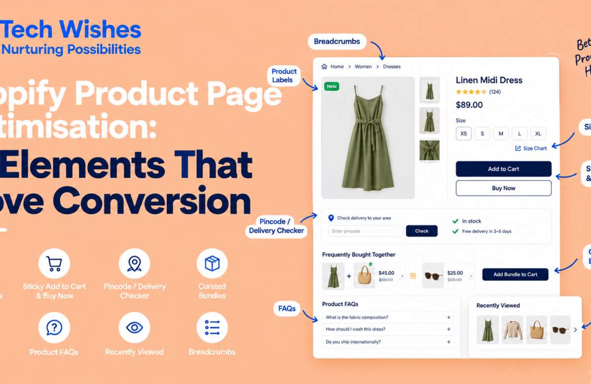
By the time a shopper lands on a product page, the ad or the search result has already done its job — they’re interested. What happens next decides whether that interest turns into a cart. Not with a redesign, usually, but with a handful of specific, well-placed elements that answer the questions a shopper is quietly asking: is this in stock, will it fit, can I get it in time, is it worth the price. Below are the ones worth getting right first, each doing a distinct job on the page.
1. Product labels that mean something
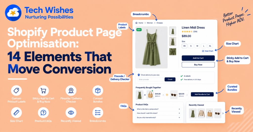
A small badge in the corner of a product image — “Trending,” “New,” “Only a few left” — does more work than its size suggests. It tells a shopper where to look first and gives them a reason to look closer, especially when they’re scanning a collection page rather than reading it line by line. The failure mode is using labels decoratively, slapping “Bestseller” on everything until the word stops meaning anything. Reserve labels for what’s actually true of that product right now, and let them change as stock and demand change.
2. A purchase button that follows the page
Once a shopper scrolls past the fold — into images, description, reviews — the “Add to cart” button is gone, and getting back to it means scrolling up. A sticky bar that keeps the buy action visible the whole way down removes that one bit of friction, and on pages with long descriptions or a lot of gallery images it tends to be one of the highest-leverage changes you can make, precisely because it costs the shopper nothing extra to act.
You’re looking at this pattern right now — the bar fixed to the bottom of this page is the same idea applied to a blog post instead of a product.
3. An upfront answer on delivery
“Will this actually reach me, and when?” is one of the first questions a shopper has, and if the page doesn’t answer it, they’ll go looking elsewhere — sometimes on a competitor’s site instead of yours. A simple pincode or postcode checker on the product page, giving a real serviceability and delivery-window answer before checkout, closes that gap early rather than surprising the shopper with it at the cart.
4. Bundles you actually chose
Generic “customers also bought” widgets are driven by an algorithm that doesn’t know your catalogue the way you do. A curated pairing — this candle with that matchbox, this shirt with that tie — reads as a recommendation rather than an upsell, because it is one. It also tends to lift average order value more reliably than automated cross-sell, since the pairings are ones you’d actually make yourself.
5. A size chart, right where the decision happens
For apparel, footwear, and anything with fit involved, uncertainty about sizing is one of the most common reasons a cart gets abandoned — and one of the most common reasons for a return when it doesn’t. Putting the chart on the product page itself, next to the size selector, means the shopper resolves that doubt at the moment it comes up instead of guessing and hoping.
6. FAQs that pre-empt the objection
Every product has a short list of questions that come up again and again — what it’s made of, how to care for it, whether it ships internationally, what the warranty covers. If answering those means opening a chat widget or hunting for a help page, some shoppers just won’t bother, and the sale quietly stalls. Putting the recurring questions directly on the page, as a short accordion, answers the objection at the point it’s raised.
7. A way back to what they were just looking at
Shoppers comparing two or three products rarely commit to the first one they open. A “recently viewed” row means the second and third product are one tap away instead of a re-search, so the comparison stays easy and the shopper doesn’t lose the thread — and doesn’t lose interest along with it.
8. Breadcrumbs, so nobody gets stuck
It’s a small, unglamorous element, but breadcrumbs give a shopper an easy way back to the collection they came from without relying on the browser’s back button — useful after they’ve followed a few internal links or arrived from search. It’s a minor convenience on any single visit, and a consistent one across the whole store, which is where its value actually adds up.
Eight elements, one install
None of these need a theme rebuild on their own, but stitched together as separate apps they add up to a lot of scripts, a lot of vendor dashboards, and a lot of things that can quietly break on a theme update. That’s the actual case for consolidating them: not that each element is hard to build, but that maintaining eight of them separately is more work than the page is worth.
PDP Star packages exactly the eight above into a single Shopify app — toggled on from one dashboard, styled to your theme, no code edits required. Everything in this piece, live on your product pages the same day you install it.