
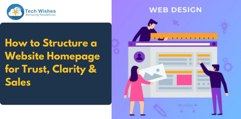
Your website homepage is the digital front door to your brand. It’s often the first impression a visitor gets, meaning it can either build trust instantly or drive potential customers away. Whether you’re a startup, a growing D2C brand, or a service provider, getting your website homepage structure right is crucial to convert traffic into revenue.
In this blog, we’ll walk you through how to create a high-converting homepage that delivers trust, clarity, and sales. Every section is built with a strategy that aligns with user expectations and SEO performance, so your site not only looks good but also ranks and sells.
Why Homepage Structure Matters
Before we dive into layout specifics, let’s understand why homepage structure plays a pivotal role:
- It sets the tone for your entire website.
- It communicates what your business does in seconds.
- It guides visitors to take meaningful actions (shop, inquire, book).
- It plays a role in Google’s UX and SEO ranking factors.
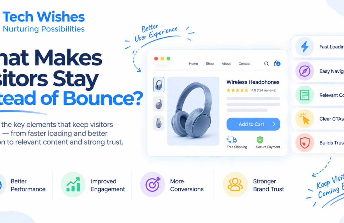
A homepage should never be cluttered or confusing. If users can’t understand your offering within the first 5 seconds, they’ll bounce, e—and your conversions will suffer.
Also Read: Why Great UI/UX Design is Your Best Marketing Investment
The Must-Have Elements of a High-Converting Website Homepage Structure
Here’s a breakdown of the ideal homepage structure that balances clarity, builds trust, and drives sales.
1. Above-the-Fold Clarity (Hero Section)
This is the very first thing a visitor sees. It should instantly answer:
“What do you offer and who is it for?”
Include:
- A clear value proposition (e.g., “Custom Websites That Convert”)
- A benefit-driven subheadline
- A strong call to action (CTA): “Start Your Project”, “Shop Now”, “Book a Demo”
- A clean visual or explainer video
Use your primary keyword here. For example: “Expertly crafted website homepage structure that builds instant trust.”
- Trust Signals Right Away
The next scroll should reassure the visitor that they’re in safe hands.
Add:
- Client logos or media mentions (“As seen in…”)
- Testimonials or star ratings
- Number of customers served / years of experience.
Visitors make emotional decisions quickly. Showing that others trust you increases your conversion rate by 30–50%.
- Introduce Your Product/Service Clearly
Now that you’ve got attention and trust, explain what you offer.
Structure this section as:
- A headline like: “What We Offer” or “Designed For Your Growth”
- 3–4 service cards or product highlights with icons/images
- Short descriptions—focus on benefits, not just features
Use variations of your keyword here, like “high-converting homepage sections” or “conversion-focused homepage design”.
- Support Your Promise with Social Proof
Don’t stop at just a few logos. Build on your credibility.
Ideas:
- Video testimonials
- Client success stories
- Case studies with measurable results
Example:
“Since reworking our website homepage structure, we’ve seen a 70% lift in qualified leads.” – [Happy Client]
Use schema markup for reviews/testimonials to boost your Google visibility.
- Solve Real Problems with Benefits Section
Show that you understand your visitors’ pain points.
Use a section like:
- “Struggling with a high bounce rate?”
- “Visitors not converting?”
- “Our homepage design strategies fix that.”
List your solutions with icons and short explanations. Keep it punchy and benefit-driven.
Include semantically related terms like “improve website experience”, “increase website conversions”, and “homepage optimisation”.
- Highlight Your Unique Selling Proposition (USP)
Why should someone choose you over competitors?
Structure:
- Headline: “Why Choose Us?”
- Bullet points or short cards with key USPs: Fast delivery, Affordable pricing, Custom design, etc.
Keep this close to your CTA so that visitors can act when persuaded.
- Drive Action with a Powerful CTA Section
Repetition is key.
Your CTA should be:
- Visually distinct (contrasting colour)
- Emotionally persuasive
- Action-oriented
Examples:
- “Let’s Build Something Beautiful”
- “Get My Free Quote”
- “Start Selling Smarter Today”
Reuse your target keyword with the CTA: “Get a custom website homepage structure that converts.”
- Navigation, Footer & Micro-Trust
Don’t overlook these essentials.
Navigation should:
- Be clean, clear, and minimal (no 15-item menus)
- Highlight important pages like “About”, “Pricing”, “Contact”
The footer should include:
- Contact info
- Social proof (certifications, awards)
- Legal pages (Privacy Policy, Terms)
- Quick links to key pages
- Trust badges or SSL icons
Why this matters: These reinforce credibility, especially for new visitors.
Mobile-First Is Non-Negotiable
Over 60% of traffic is mobile. If your homepage structure doesn’t load fast, look clean, or guide mobile users easily, your bounce rate will soar.
Optimisation tips:
- Use large, tappable CTAs
- Make images lightweight and responsive.
- Ensure clear spacing and font size.s
Final Thoughts: Homepage Structure = Strategic Storytelling
To summaries, your website homepage structure should be a carefully crafted journey:
- Grab Attention
- Build Trust
- Explain Clearly
- Solve Problems
- Prove It
- Drive Action
Your homepage isn’t a design project—it’s a conversion tool. Focus on what your visitors need, guide them intuitively, and you’ll start seeing results.
SEO Checklist for Homepage Optimisation
Here’s a quick cheat sheet to make your homepage SEO-friendly:
- Include primary keyword in H1 (e.g., “Conversion-Focused Website Homepage Structure”)
- Use clear headings (H2S) for each section
- Add internal links to key service/product pages
- Optimise all images with descriptive alt text
- Make the meta title and description compelling and keyword-rich
Need Help Crafting a High-Converting Homepage?
As a leading website development company, Tech Wishes specialises in building trust-first homepage designs that convert. Whether you’re looking to revamp your existing structure or start fresh, our team can help.
Book a free homepage audit today.